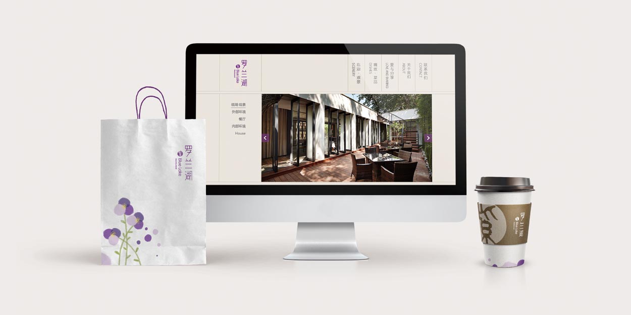
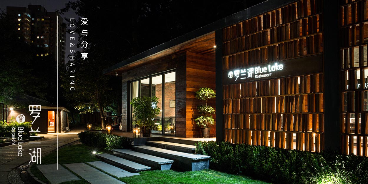
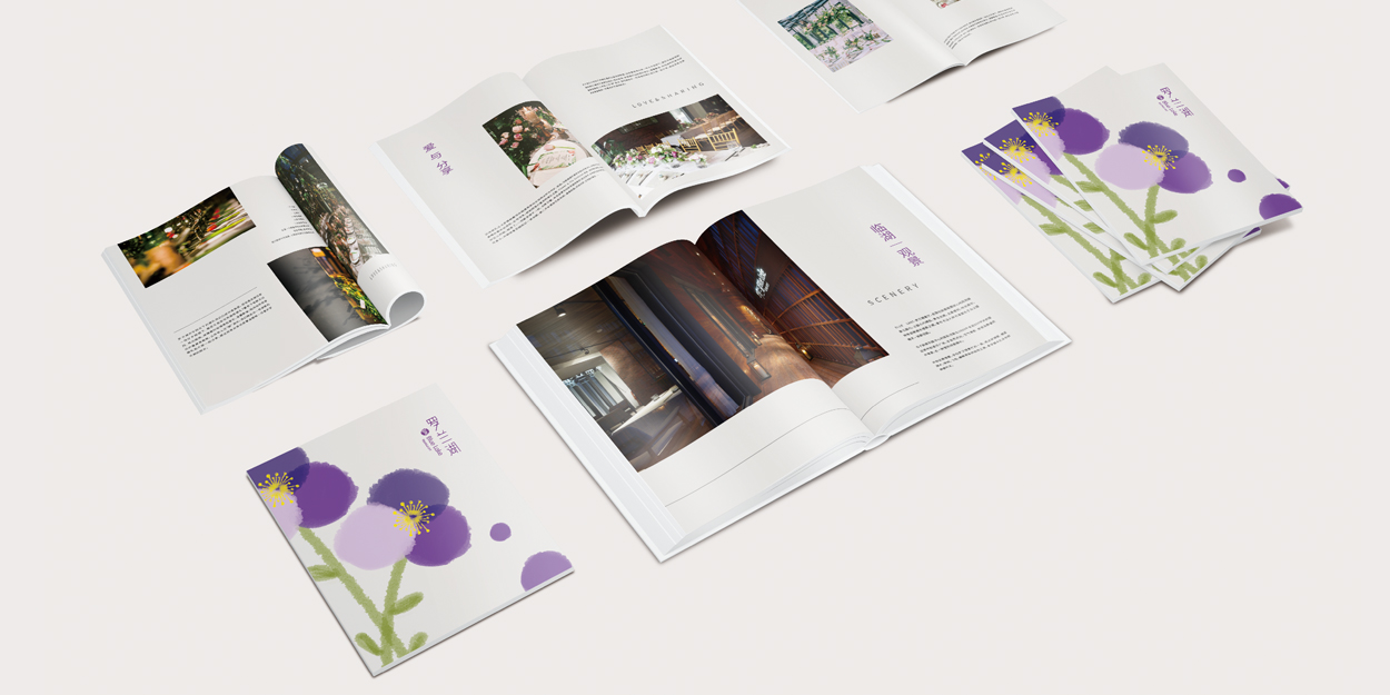
Blue Lake Restaurant is sited by a clear lake, amid a dense woods, in a city park kept quiet amid the noisy ambient. The designer endeavors to develop a sensible logo according to the original aura of the ambient. We turn the “lake” and “purple” as an innovative start point into a stamp graph to be embedded in the logo. Strokes of the Chinese characters are designed as two water drops to be mingled together. The font is designed as a “water-combining shape”, with violet pedals saturated with light color. Through delicate vision, it embodies the Chinese philosophy of “implication”. As a non-perceptive color, purple displays a quiet and reserved style especially when faded, simply expressing a visual sense of tranquility and peace.
* 获得2017年iF设计奖(iF DESIGN AWARD 2017)
服务行业:餐饮
服务客户:罗兰湖餐厅
服务内容:标志/VI视觉识别系统、品牌整合设计。


至2016年,罗兰湖作为北京新崛起的环境餐厅,已囊括IF、德国红点等多个国际大奖,并被评为北京十大环境餐厅之一,宝马、谷歌、亚马逊、戴尔、爱奇艺等,都将罗兰湖餐厅作为活动的指定举办场所。
“湖边的餐厅”罗兰湖,正以全新的姿态,焕发无限生机。
