iF官网作品展示
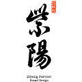
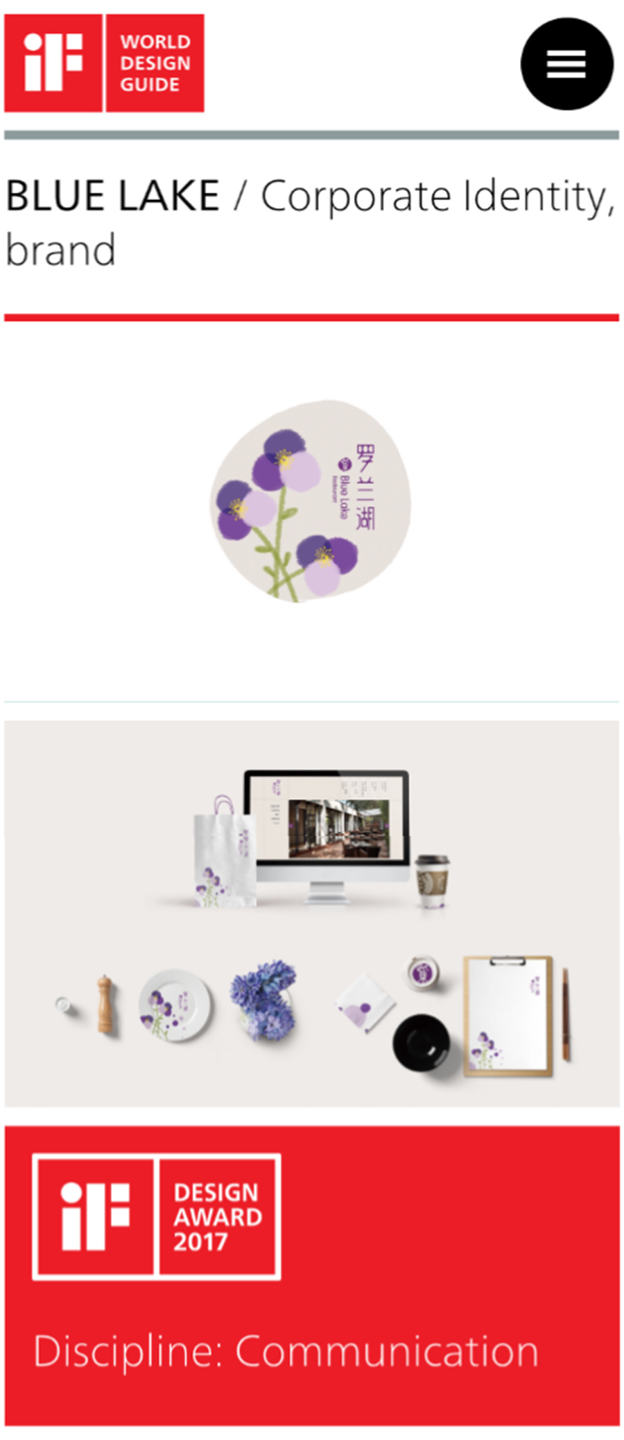
紫阳伙伴根据环境原本的精神气质,发展出可感知的品牌识别。我们将“湖”与“紫”作为创意原点转换为印章图形呈现在标志里。中文字体的笔划设计就像两颗水滴即将交融,这个字体被设计师称为“水融体”。淡彩晕染的紫罗兰绽放在主视觉画面里,当花瓣淡化的时候,呈现出幽静与内敛的姿态,能给人们带来安静平和的视觉感受。
BLUE LAKE restaurant is sited by a clear lake amid a dense wood in a city park kept quiet amid the noisy ambient. The designer turns the “lake” and “purple” as an innovative starting point into a stamp graph to be embedded in the logo. Strokes of the Chinese characters are designed as two water drops to be mingled together. The font is designed as a “water-combining shape” with violet pedals saturated with light color. Through delicate vision, it embodies the Chinese philosophy of “implication.” As a non-perceptive color, purple displays a quiet and reserved style especially when faded, simply expressing a visual sense of tranquility and peace.

小院儿主人的颁奖合影

颁奖现场-宝马世界
★ 自驾穿行德国——奥地利——捷克。
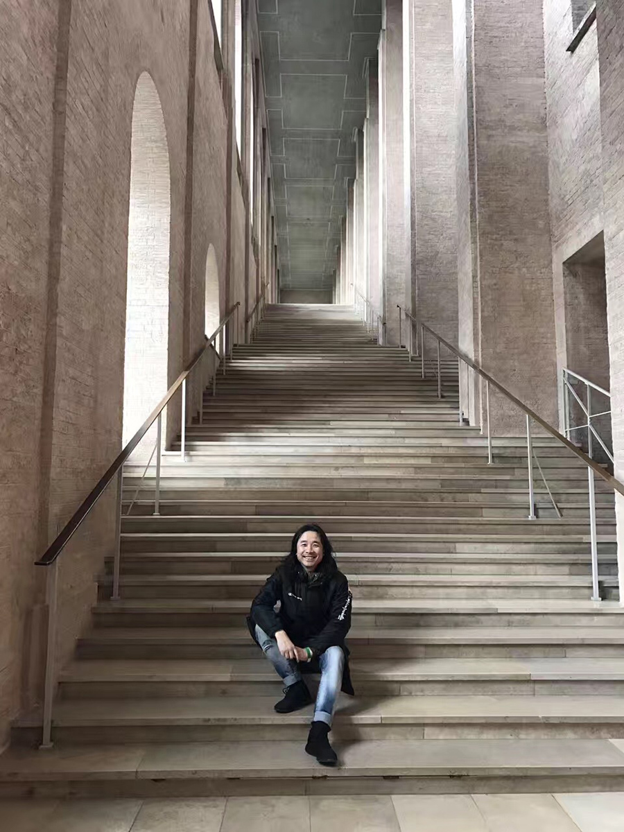
参观慕尼黑老绘画博物馆
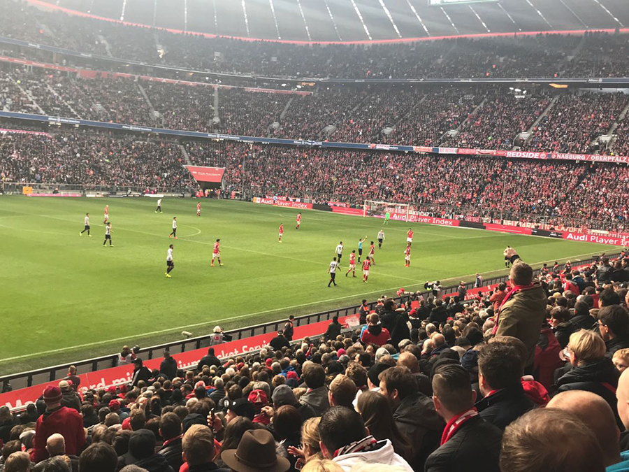
在安联球场观看拜仁慕尼黑与法兰克福比赛
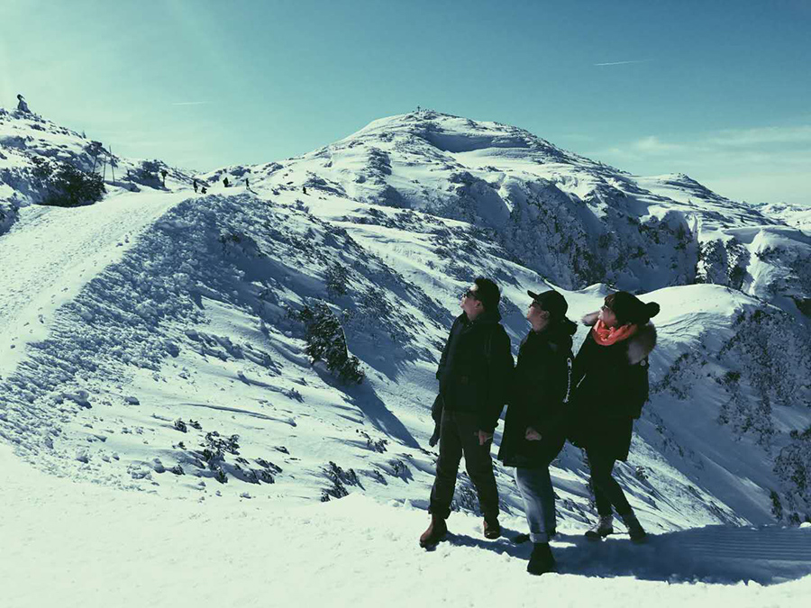
登上温特山
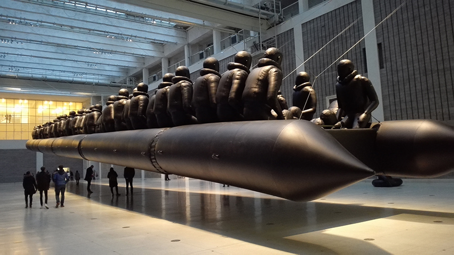
艾未未在捷克国家博物馆的“Law of the journey”展